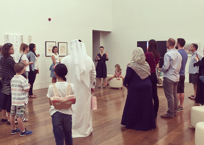
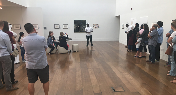
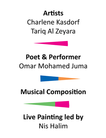
This exhibition gathered perspectives on the topic of colour from the disciplines of fine art, poetry, and music theory.
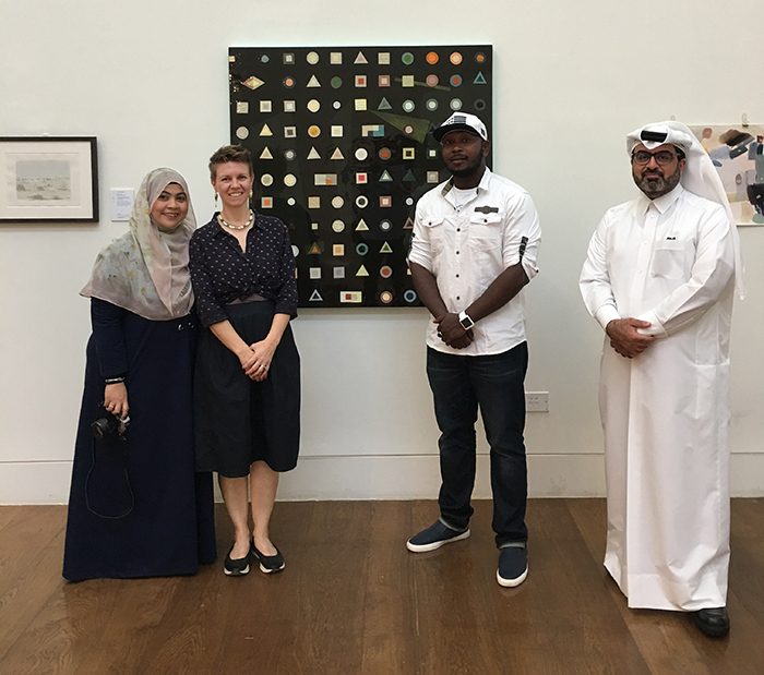
From left to right: Nis Halim (Malaysia), Charlene Kasdorf (Canada), Omar Mohamed Juma (Kenya), Tariq Al Zeyara (Qatar)
The quest for colour:
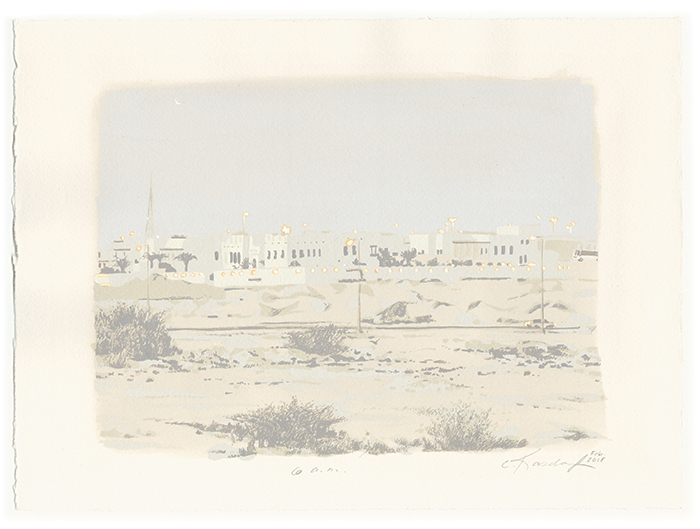
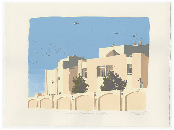
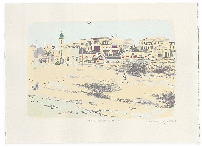
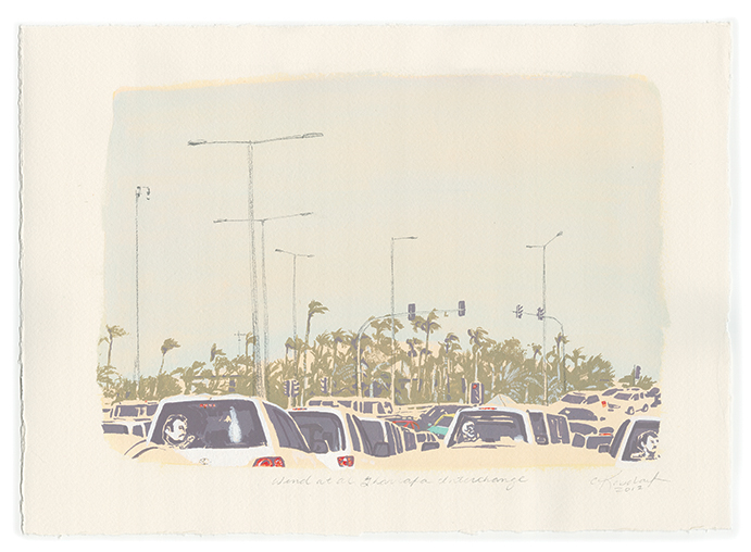
“When I moved to Doha in 2012, I read an opinion piece in a magazine that deduced Doha’s skyline colour to two hues; sand-beige and beige. On the contrary, Qatar’s intense dessert light heightened my sensitivity to the subtlest of contrasts.” –– Charlene Kasdorf
In Doha, a person’s sensitivity to colour contrast can became more acute, similar to the adjustment of vision in the dark. An awareness of fine colour subtleties strengthen one’s awareness of colour as a whole.
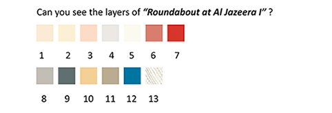
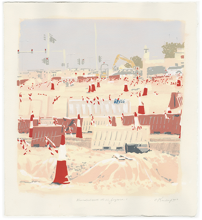
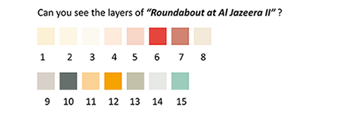
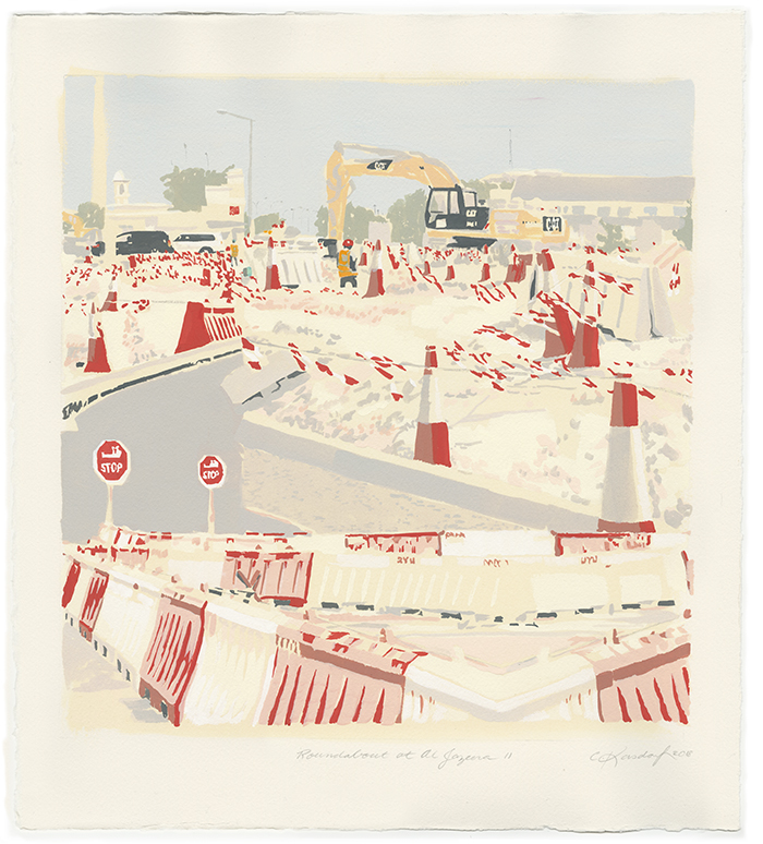
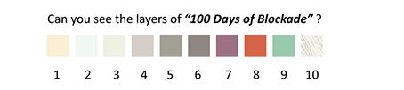
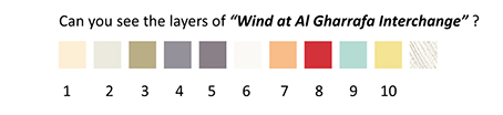
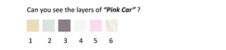
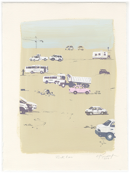
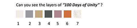
Can you detect all the indicated layers in the series of paintings below?
The first one has 8 layers of colours:


Artwork Materials:
- Archival and quality materials
- Winsor & Newton Gouache and Arches Cotton Paper (300 g/m2)
- Wooden frame and museum-quality CLARYL glass (UV protective and non-reflective)
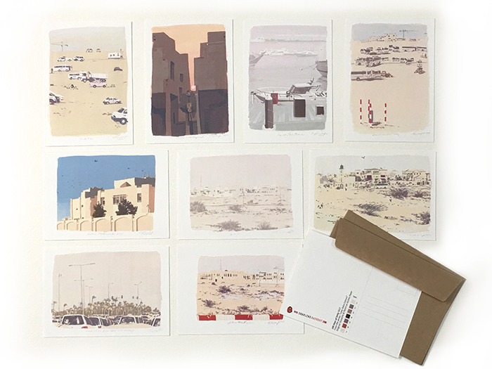
10 Colour Cards / Postcards with envelopes (50 QAR)